
Responsive Website Redesign
CANADA COUNCIL FOR THE ARTS
Empower artists in their pursuit to find funding opportunities and support the Council in its mission to create a vibrant and diverse Canadian art scene.


Background
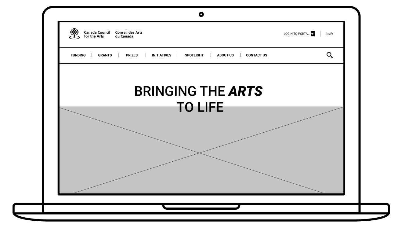
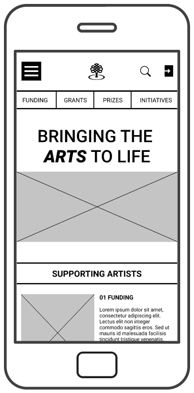
BRINGING THE ARTS TO LIFE
The Canada Council for the Arts is Canada’s public arts funder, it's a government agency that plays a big role in defining the Canadian Art scene, with a mandate to “foster and promote the study and enjoyment of, and the production of works in, the arts.”

The Challenge
FUNDING BARRIERS
Working as an artist can sometimes be financially unpredictable, grants can remove the financial burdens and allow artists to focus on their work. Searching and applying for funding, grants or competitions can be overwhelming and burdensome.
The council’s website is not removing some of the load it takes to search, decide and apply for such programs. When visiting the website artists are discouraged by the complex navigation, unorganized information and confusing eligibility process.
Our Goal
IMPROVING ACCESS TO RESOURCES
Since the website has an informational and functional purpose, it's not able to create a seamless experience between providing information and enabling its users to apply.
Our goal for this project was to help users find the information they want, complete their tasks and secure a funding opportunity so they get to focus on their work and grow as artists.
As more and more artists apply for funding, the council can get larger funding support and have a larger impact on the Canadian Art scene.

.png)
MY ROLE
This project timeline was 4 weeks, during I worked with 3 amazing UX/UI designers. I took on different roles from user researcher to product design to visual design.
WIREFRAMES
RESEARCH
INFORMATION
ARCHITECTURE
PROTOTYPE
USABILITY TESTING
UI DESIGN
DESIGN PROCESS
.jpg)
-
User Research
-
Heuristic evaluation
-
Define Problem
-
User Journey and Flow
-
Card Sorting
-
Sitemap
-
Develop solutions
-
Low, Mid-Fidelity Wireframes
-
Usability Testing
-
Prototyping
-
Iterate and Redesign
-
Design Style Guide

Research
UNDERSTANDING CURRENT EXPERIENCE
1) Before we started our user research, we needed to examine current interface, judge its compliance with recognized usability principles and discover usability problems.
To accomplish that we conducted heuristic evaluation individually and later communicated our findings to overlap and identify the most important usability issues.

Redlining - measure the usability of user interfaces in independent walkthroughs and report issues

2) Tested the existing website with 6 participants. Our goal was to:
-
Uncover artists' primary objectives visiting the website to define optimal user paths.
-
Examine the challenges encountered when trying to accomplish a task.
-
Usability issues defined by the user.

Key Finding
DROP OFF AT ELIGIBILITY CHECK
50% of our participants stated clearly that they would not complete applying because the "Eligibility" form was unclear and overwhelming. They would instead contact the council to clarify the application process and make sure they are filling the right information.

WHEN NAVIGATION BECOMES A BOTTLENECK

Users spent between 3-5 minutes to find needed information

-
Users would lose their way when using the navigation. They were confused by navigation labels, hierarchy and hovering state.
-
They expected the home page to help them access their main goals.
67.5% average success rate at finishing their tasks

success rate
Key Finding
Key Finding
ENGAGEMENT & READIBILITY
-
Although users found the website design to be modern, they expressed that it lacks interaction, engagement and images that provide context.
-
Users found some sections to be hard to read and understand due to lack of contrast and font size.
Based on findings and heuristic evaluation, I narrowed my focus into 5 areas for potential improvement:
_edited_edited_e.png)


_edited_edited_e.png)

Solving
NAVIGATION HIERARCHY, DESIGN AND INTERACTION
Navigation played a big role in preventing users from successfully finding information and finishing their tasks.
To start working on the navigation I had to first understand how would users organize the website information
CARD SORTING
During this activity, I was able to observe users as they organized the cards. It allowed me to understand users' priorities, mental models and expectations.
One key insight was users introducing a new category called "Application" it included all application related regardless of what service they are applying for, users expected all information to be in one place.
.jpg)
Funding
Grants
Application
Research
About
Accountability
Privacy
Funding Principles
Explore and Create
Guide to Getting a Grant
Stats and Stories
Press
Proactive Disclosure
Access to Information and Privay Acts
Media Arts Equipment Acquisition Fund
Engage and Sustain
Am I eligible?
Research Library
Careers
Public Feedback Process
Canadian Anti-Spam Legislation
Strategic Funds and Initiatives
Supporting Artistic Practice
How many times can
I apply?
Data Tables
Contact
Corporate Policies and Documents
Copyright
Decision-making process
Art Across Canada
Getting Started
Glossary of grant-related terms
Report Forms
Respectful Workplaces
Privacy Notice
Info Source
Public Lending Right
New/Early Career Artists
Important Notices
.png)
SITEMAP
Referencing feedback from the card sorting activity. It was time to define the hierarchy and navigation to create the structure and define how users will move through it.
I faced particular challenges with labelling and terminology. The council uses static names for the programs they fund, that users did not relate to or understand. Do these programs apply to them? To solve this problem, I followed the users mental model, by grouping the programs into applicant type for example: For Individual Artists, For Art Organizations, for intuit, For First Nations, Inuit and Métis Artists"
.jpg)
WIREFRAMING
Solving
IMPROVE ACCESS TO MAIN USER FLOWS
-
Many users would access the council website from their mobile. Accordingly, it was important to create mobile-first wireframes.
-
Most users first scrolled through the home page to learn how the council can support them. The current council’s website does not utilize the user’s automatic behavior, instead treats the home page like a news page.
To match users expectation, I added the council’s services on the Home Page.
-
Based on our research, users needed a simple and organized hierarchy, allowing them to explore navigation items without being overwhelmed with the number of pages provided.
-
Most users had problem with the current menu hover effect. To solve for that problem, I decided to swap the hover effect with click interaction, giving the user agency to decide when to explore tertiary menu.
Solving
IMPROVE "CHECK YOUR ELIGIBILITY" PROCESS
To reduce the cognitive load during form filling, I split the form into main tasks and designed a multi-step form

Feedback
USABILITY TESTING
Before I could jump into testing, it was important to define success. For the user it was important to find information fast to make insightful decisions on which grant, initiatives or competition to apply to.
To measure if I have solved for that problem, I will be:
-
Comparing the time users need to finish their tasks between the current and proposed structure
-
Task success rate.
-
Users feedback on the new experience and information archeticture
Feedback
RESULTS
97.5% average success rate at finishing their tasks

Users spent less than 1 minute to find needed information
Feedback
IT'S NOT ALL PERFECT
Although the tasks success rate was higher than the current website and navigation's new design and hierarchy helped users find their needed information much faster and easier.
I noticed from observing users and asking questions the following:
-
Users were skimming the eligibility criteria and weren't reading through it.
-
The last step in "Check Your Eligibility" process, seems to be unnecessary for the user since they found they are eligible to apply.
-
Users assumed in the "Add Profile" step that they would be uploading their work, due to the label and button style.

Solving
ENHANCE EXISTING BRAND
The design aesthetic embodies a dynamic, creative sensibility that resonates with the Council's mission: to enrich and diversify the arts and literary landscape. Utilizing a palette of vibrant, contemporary colors, the style not only captures the essence of artistic diversity but also conveys the dynamism inherent to the arts.

Typography
H1 - Title
Open Sans Semi Bold
48px
H2 - Subtitle
Open Sans Semi Bold
24px
H3 - Subtitle
Open Sans Semi Bold
18px
P - Paragraph
Metropolis
14px
Color Palette
CONSISTENCY IS KEY
In order to ensure a uniform visual experience and expedite the design workflow, I developed a suite of reusable UI components that serve as the building blocks for the new design.

Final Solution
HIGH-FIDELITY PROTOTYPE
Navigation structured around users priorities and mental models


.png)

Explore grant opportunities, and have access to important action items such as
-
Access to Portal
-
Check Eligibility
-
Getting Started
-
Application Assistance and more